Vancouver Community College
Rebrand
School Project, 2021
Concept development, logo design, corporate identity, brand environment, visual systems, layout
Overview: VCC is one of Greater Vancouver’s three public colleges. It offers post-secondary degrees and certifications with an emphasis on students being prepared and hirable after graduating, typically at lower tuition costs than universities and private institutions.
Design Opportunity: VCC’s language and tone are relevant and current, promoting a socially progressive approach, especially regarding reconciliation. They emphasize a hands-on, experiential type of applied learning for the real world. However the visuals feel outdated, clunky, and stiff. VCC is a reputable name in the public post-secondary education scene in Vancouver, but its current identity has lost its allure. This reprand is an opportunity to enliven VCC's visual identity to reflect its vibrant community and high-quality instruction with a confident, robust new look.

VCC Planner design.
Solution: Based on three visual words representing Vancouver Community College's brand:
Welcoming
Reliable
Adaptable
Build a dynamic visual network that reflects VCC’s commitment to providing an experiential education that opens doors and forges connections.
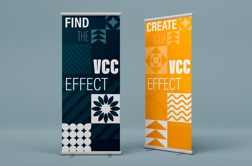
Collateral: roll banners.
Colours: The new colour palette of warm grey, golden ochre, and deep blue combine to create a confident, welcoming, yet professional visual environment. As the main brand colour, the rich blue holds its own, but also acts as a versatile base for the visual landscape. With its turquoise tint, it has a younger energy than the royal blues typically seen in corporate marketing, but without losing its professionalism and trustworthiness. The new grey is warmer and more welcoming than the old grey, and the yellow-gold enhances the brand environment with its sophisticated and bright pop.

Logo and wordmarks.
Logos:

Stationery.
Patterns: The primary visual framework at play in this new brand environment is the set of blocks and textured squares interspersed and layered with each other. The designated patterned blocks come in three categories (one set for each of the brand colours), representing three principles. The grey set is based on the idea of community, and all designs are based on a grid. The ochre set represents the self, with concentrically aligned patterns. The blue set represents the river that has featured in all of VCC’s logos to date, as it is a crucial part of the natural environment where VCC was founded and still sits. With these patterns, these “effects,” existing in various combinations in the extended brand environment, the emerging visual landscape could resemble building blocks or a quilt pattern, both homage to the humble yet important work that VCC grads contribute to society and their communities upon graduation.

Fifteen patterns forming the basis of VCC's visual environment.
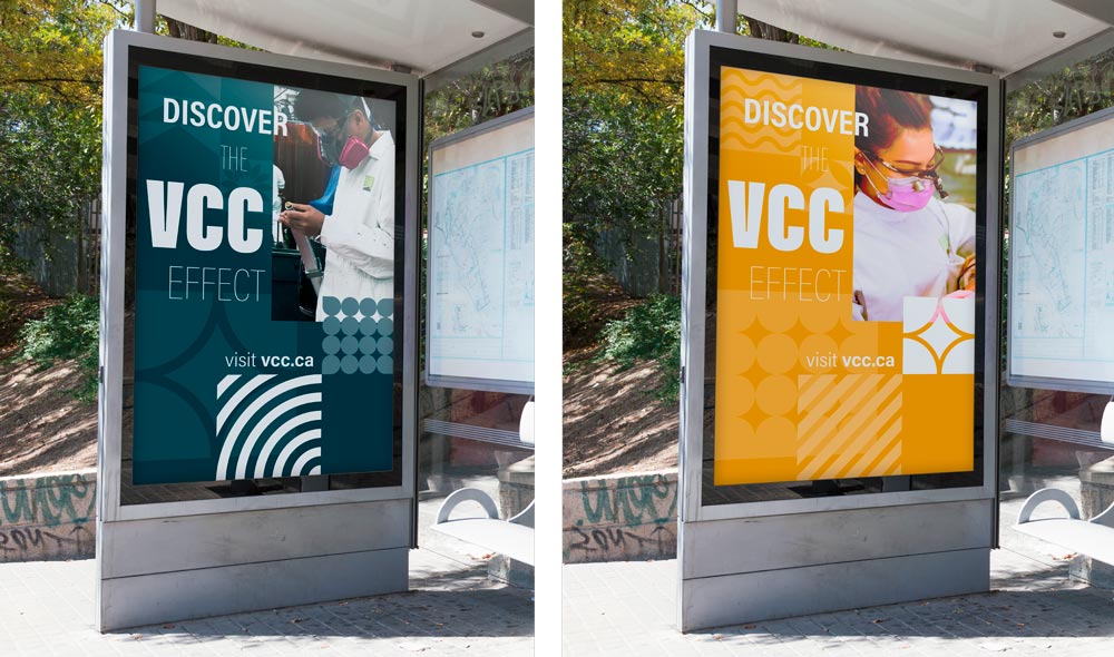
Collateral: bus stop posters.
Photography: The photography is more of a refresh than a rebrand. Similar to the previous stock, the new photography features students engaged, focused, and confident in their work. Most images are medium cropped to the main person, far enough to keep their activity visible in the shot. It is important that the subjects look natural, candid in their environment where they are applying their skills. The previous photo bank had several images with stiff smiles and stock-like qualities.